menu
Close

GET IN TOUCH
Check what other game developers say about working with RocketBrush Studio:

BLOG
All the information a player needs during the game should be easily accessible. That’s where HUDs come in and directly affect gameplay clarity, retention, and usability. Poor video game HUD decisions often make a title harder to navigate and lead to rework during integration. In this article, we explore what is HUD in games, review the best and worst practices when it comes to HUD design and learn how it fits into production.
In games, a heads-up display, or HUD, is a surface-level UI layer with real-time information supporting player decisions. It’s a critical element of gameplay and presents such core functions as:
The UI vs HUD distinction confuses a lot of newcomers to game design, but the difference actually comes down to focus. Since the UI includes all interaction systems (menus, inventory, settings). HUD exists as a subset of UI tied to moment-to-moment gameplay. If you're wondering about hud meaning in gaming, think of it simply as "the information you see while you're actually playing," as opposed to the broader UI, which includes everything you interact with outside of active gameplay too.
Additionally, UI can be developed in parallel to other features, but HUD must be tightly integrated with gameplay systems and telemetry.
Video game HUD is strongly influenced by the genre and the style of the title. That doesn’t just mean visual choices but also includes the logic behind the layout and the necessary information. For example, in shooters, players need to be aware of their HP and ammo count. In races, speed and maps are crucial, and in RPGs, quest trackers and progress bars are key features.
The most important elements of a HUD can be separated into several groups. The graphic below shows different types of elements depending on their function in the game:
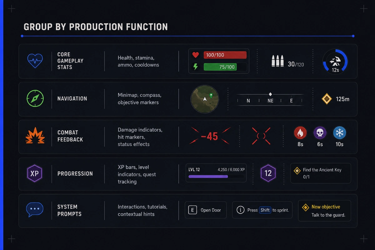
Understanding how hud in video games fits inside the larger UI system helps designers strike the right balance between giving players useful information and keeping the screen clean enough not to break immersion.
A good HUD in video games is defined not only by how it looks, but by how well it supports the game’s core decisions. These game HUD examples show how genre, platform, camera, and gameplay pace determine which information stays visible, where it appears, and when it is shown.
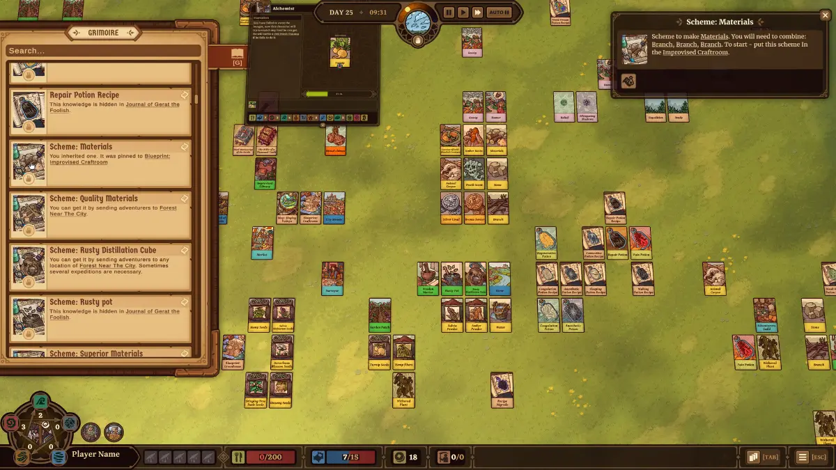
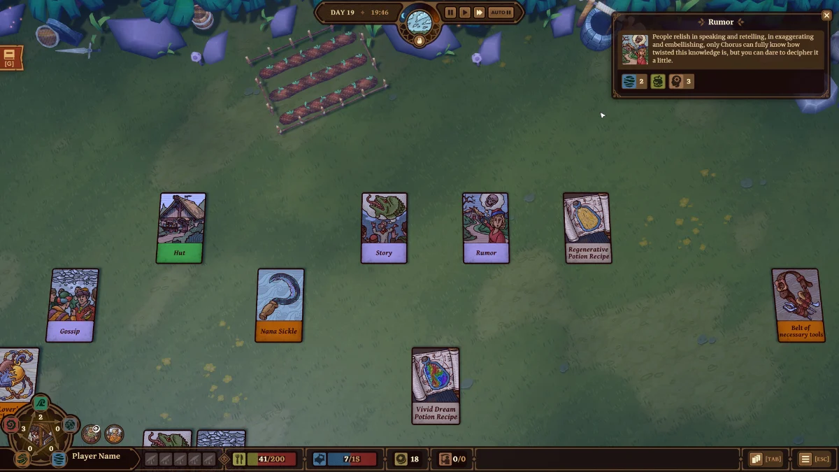
Ways of Alchemy is a survival card game developed by RocketBrush. During production, we separated persistent resources and status indicators from contextual information: core values remain visible along the screen edges, while card choices and objectives appear when they become relevant to the player’s next decision.
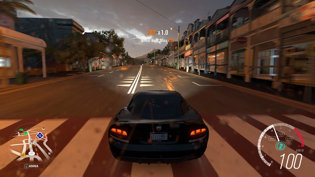
For a racing simulator, the main HUD elements include speed, player’s place in a race, and a mini-map with the outline of the track. In Forza Horizon, some details, like points gained or lost, also appear closer to the center without permanently blocking the road view.
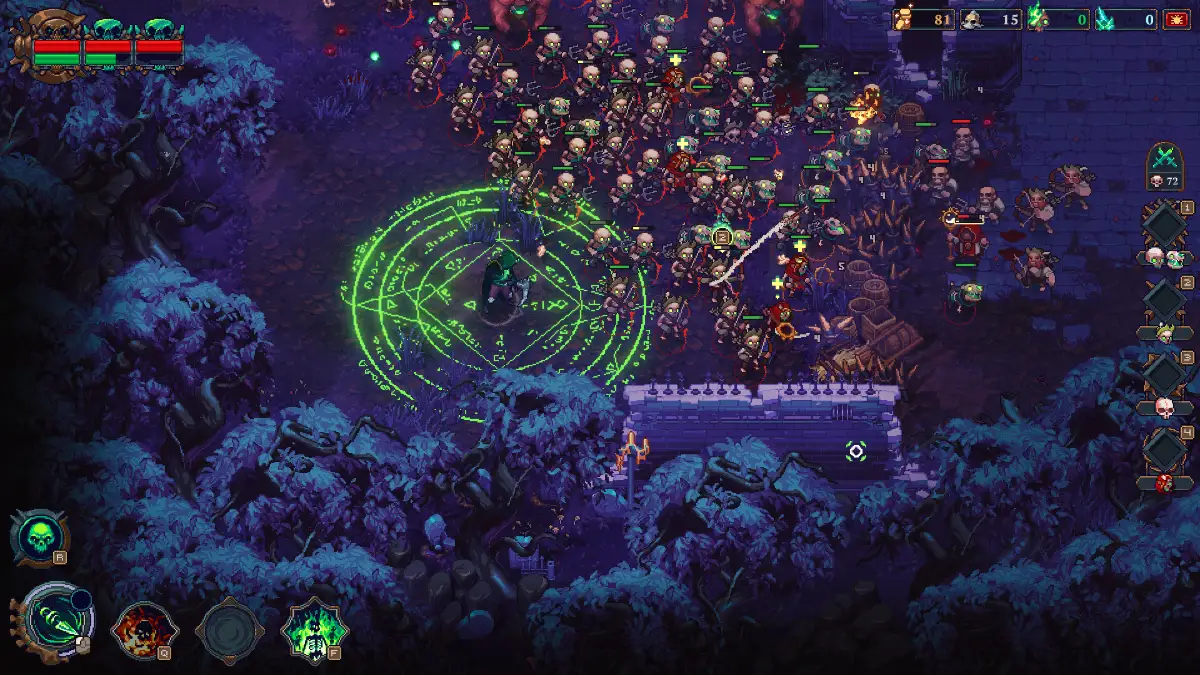
The Unliving is an indie action RPG fully developed by RocketBrush. Because players control a large army during fast-paced battles, we grouped the HUD elements by function: health and army status appear in the upper-left corner, resources in the upper-right, and abilities along the bottom. Health bars above units provide immediate combat feedback without drawing attention away from the battlefield.
HUDs are often implemented using sprites - 2D animated images. In our dedicated article, we cover what sprites are and how they are used in games.
[[ref:sprites-in-game-design]]
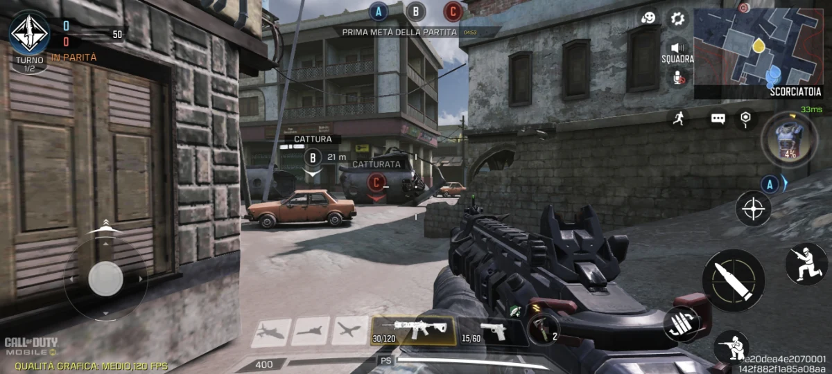
FPS games such as Call of Duty: Mobile depend on speed and reaction, so the HUD combines core combat data with touch controls. The minimap and match status remain at the top, weapon and ammunition information sits near the bottom, while movement, aiming, firing, and ability controls are placed around the screen edges for quick access.
Game remasters often include a rework of the existing HUD, along with updated graphics and overall look. You can learn more about remasters and their difference from remakes from our article.
[[ref:the-difference-between-remasters-remakes-reboots-and-ports-in-games]]
Before starting HUD production, teams need to define the rules that will govern how information is presented and prioritized during gameplay. A video game HUD should be experienced as a functional system dictated by gameplay conditions, platform constraints, and player behavior.
Design for failure cases, not ideal screens. HUD elements should remain clear under motion, visual effects, and changing gameplay conditions.
It also helps to introduce safe zones and minimum size thresholds for text and icons. For console and TV setups, readability has to be validated at both target resolution and distance.
While designing HUDs, it helps to use dynamic backgrounds, outlines, or adaptive opacity to maintain clarity under changing lighting.
Define priority tiers upfront (primary, secondary, tertiary) and enforce them consistently.
To guide attention instead of overwhelming it, it helps to use motion, timing, and animation sparingly. Additionally, always build UI rulesets (spacing, sizing, color usage) that enforce hierarchy across all screens.
To properly test the HUD in video games for realistic conditions, you need to understand how animation works. Our article breaks down the main aspects of 3D and 2D animation.
[[ref:2d-vs-3d-animation-for-games-how-to-choose-the-right-approach]]
HUD density and behavior are usually aligned with genre expectations early in pre-production. It helps to benchmark HUD against genre standards and validate with quick prototypes rather than static mockups.
Instead of scaling one solution, adapt layouts to platform-specific constraints:
Match information load to gameplay speed. Fast-paced games work better with on-screen elements reduced to essentials and quick visual cues (icons, color flashes, short animations). In slower-paced games, deeper information layers work better. During high-intensity moments, it makes sense to automate or hide non-critical data.
In our experience, one of the most important principles is to use progressive disclosure — show more detail only when the player has time to process it. If you are developing a game project and choosing the right approach to designing a heads-up display, reach out to our team at RocketBrush and take advantage of our expertise.
[[cta:Looking for a clear and unique HUD?:Tell us about your game, and our art team will develop one tailored specifically to your project.]]
Even a visually polished HUD can fail if core production principles are ignored. Most issues come from poor planning, unclear priorities, or insufficient testing rather than aesthetics. Identifying these risks early helps reduce iteration costs and improves gameplay clarity.
1. Avoid overloading the HUD — too much information reduces readability and slows decision-making.
A common mistake is trying to display too much information at once. Not every available data point needs to be visible during gameplay. Focus on what supports the core gameplay loop, and move secondary information into contextual states, menus, or optional views.
2. Test the HUD in real gameplay — a layout that works in mockups may fail during play.
A HUD in video games can look effective in a static presentation and still become unreadable under real conditions. Testing should happen with gameplay captures, visual effects, camera movement, and different scenarios to reveal issues before implementation is complete.
3. Build a clear typography system — inconsistent text styles reduce legibility and clarity.
Typography needs a structured approach from the beginning. Standardize font usage, establish clear size relationships between information levels, and define fallback solutions for different platforms and languages. Every text element should remain readable at target resolution.
4. Give colors defined roles — inconsistent color use creates visual noise and unclear signals.
Color should communicate function, not just aesthetics. Assign clear roles to colors, limit unnecessary highlights, and preserve semantic meaning across the entire HUD. A consistent color system helps players recognize important information faster.
5. Don’t rely on raw data alone — numbers can take longer to understand than visual feedback.
Numbers and statistics are not always the fastest way to communicate information. Convert raw data into recognizable visual feedback where possible, combining icons, animations, effects, and other feedback channels to improve player understanding.
6. Structure the layout around player attention — poor grouping makes information harder to scan.
HUD elements should have a clear purpose and placement. Group related functions together, avoid unnecessary visual competition, and consider how players naturally scan the screen. In some cases, diegetic UI solutions can improve immersion and reduce screen clutter.
7. Design for the target platform from the start — ignoring its constraints leads to usability issues and costly rework.
HUD should be designed with the target platform in mind from the beginning. Different devices require different approaches to interaction, visibility, and screen usage. Early consideration of these limitations prevents major adjustments later in production.
A successful video game HUD is not just a visual layer, it is a gameplay system built around player needs. The strongest results come from early planning, clear information priorities, and continuous validation throughout production.
Before breaking down the process, the footage below shows what HUD design needs to achieve in practice. No Way Out is a game prototype developed by RocketBrush. Its HUD combines inventory interactions, contextual prompts, and resource tracking while keeping the action readable.
A good HUD is developed iteratively, from defining gameplay needs to testing the system under real conditions:
1. Pre-Production (Definition & Planning). During this stage, gameplay is analyzed, considering the target platforms and references. At RocketBrush, we apply early UX logic to develop what the screen would look like for a player.
2. UX & Information Architecture. Determining visibility rules and persistent vs contextual UI is the key point of this HUD development stage. Information hierarchy plays a core role here, as we study the flow of players’ attention and better ways to incorporate necessary information.
3. Visual Design. When it comes to the visual style of the HUD, the main principle is alignment with the general art direction. Icons, maps, and bars must highlight the genre. For example, a sci-fi game could have data displayed on neon screens, while brass or stone is likely to fit into a fantasy game.
4. Prototyping & Testing. It’s vital to make sure that everything works as intended. An overlay on gameplay captures is often used for the prototype, then the team alters the HUD based on readability and usability. This is where target platforms play a role as well, and that doesn’t come down only to clean scale across resolutions and aspect ratios but also includes accessibility settings.
5. Integration & Implementation. This stage translates HUD assets into a working system under real constraints. The goal is to align HUD with the target engine while preserving consistency. Optimization is non-negotiable, either — this is where you control memory, reduce draw calls, and maintain performance budgets. Weak implementation will break an otherwise solid design, so tight coordination between art and engineering is critical.
6. Polish & Feedback Systems. The final stage is reserved for final readability checks under gameplay stress. It has more to do with testing and adjusting, but it arguably is the most crucial part.
If you are looking to create a HUD that fits your game’s visual style and technical requirements, working with an experienced game art team can help bring these elements together effectively. Choosing the right production partner is an important step, learn more about it in our guide.
[[ref:how-to-choose-game-art-outsourcing-studio]]
A successful video game HUD is more than an information overlay — it is a core gameplay system that shapes how players understand, interact with, and respond to a game. Effective HUD design requires balancing readability, information hierarchy, genre expectations, platform limitations, and technical requirements from the earliest stages of production.
The strongest results come from treating HUD as part of the overall game experience rather than a final visual layer added at the end. By planning early, testing in real gameplay conditions, and maintaining close collaboration between artists and developers, teams can create HUD systems that improve clarity, immersion, and player satisfaction while avoiding costly redesigns. If you are starting work on a game project and looking for a team that can design a comprehensive, good HUD, contact us at RocketBrush.